Carousel
A slideshow component for cycling through elements—images or slides of text—like a carousel.
Example
Carousels don’t automatically normalize slide dimensions. As such, you may need to use additional utilities or custom styles to appropriately size content. While carousels support previous/next controls and indicators, they’re not explicitly required. Add and customize as you see fit.
The .active class needs to be added to one of the slides otherwise the carousel will not be visible. Also be sure to set a unique id on the .carousel for optional controls, especially if you’re using multiple carousels on a single page. Control and indicator elements must have a data-bs-target attribute (or href for links) that matches the id of the .carousel element.
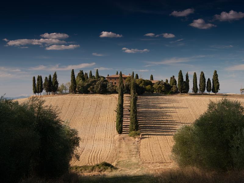
Slides only
Here’s a carousel with slides only. Note the presence of the .d-block and .w-100 on carousel images to prevent browser default image alignment.


With controls
Adding in the previous and next controls. We recommend using <button> elements, but you can also use <a> elements with role="button".
With indicators
You can also add the indicators to the carousel, alongside the controls, too.

With captions
Add captions to your slides easily with the .carousel-caption element within any .carousel-item. They can be easily hidden on smaller viewports, as shown below, with optional display utilities. We hide them initially with .d-none and bring them back on medium-sized devices with .d-md-block.
First slide label
Some representative placeholder content for the first slide.

Second slide label
Some representative placeholder content for the second slide.

Third slide label
Some representative placeholder content for the third slide.
Fade transition
Add .carousel-fade to your carousel to animate slides with a fade transition instead of a slide.
Dark variant
Add .carousel-dark to the .carousel for darker controls, indicators, and captions. Controls have been inverted from their default white fill with the filter CSS property. Captions and controls have additional Sass variables that customize the color and background-color.
First slide label
Some representative placeholder content for the first slide.
Second slide label
Some representative placeholder content for the second slide.

Third slide label
Some representative placeholder content for the third slide.